- Key Takeaways
- Table Of Contents
- 1. Why Printed Guides Still Work
- 2. Define the Reader Before Writing
- Questions to Answer First
- 3. Plan the Content in a Simple Order
- 4. Make Every Page Easy to Scan
- Design Choices That Support Fast Reading
- 5. Blend Printed Content With Digital Updates
- 6. Choose the Right Format for the Job
- 7. Proof, Test, and Improve
- 8. Common Mistakes to Avoid
- 9. A Print Guide Checklist
Key Takeaways
- Start with the reader’s questions, not a blank design file.
- Put urgent information where people can find it in seconds.
- Use headings, lists, labels, and open space to make pages easy to scan.
- Keep essential details in print, then use digital tools for information that changes.
- Check every date, name, time, price, address, and contact detail before release.
- Test the guide with a real reader before producing the final batch.
Table Of Contents
- Why Printed Guides Still Work
- Define the Reader Before Writing
- Plan the Content in a Simple Order
- Make Every Page Easy to Scan
- Blend Printed Content With Digital Updates
- Choose the Right Format for the Job
- Proof, Test, and Improve
- Common Mistakes to Avoid
- A Print Guide Checklist
A useful guide does more than look polished. It helps someone make a decision, follow instructions, find a location, or understand what happens next. Whether you are creating event programs, training materials, visitor handouts, product instructions, or booklets for a community program, the goal is the same: make important information simple to find and easy to use.
Printed guides remain valuable because they work without a login, a charged phone, or a crowded inbox. People can hold them, mark them up, pass them to someone else, and return to the same page when they need a quick answer. The strongest guides are built around the reader’s real situation, not around everything the organization wants to say.
1. Why Printed Guides Still Work
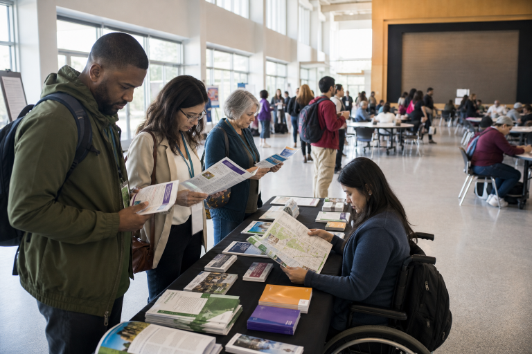
A guide is especially helpful when readers need answers while moving through a real-world setting. A conference attendee may need the next session time. A museum visitor may need a map. A student may need to review steps during a workshop. In each case, a well-planned printed piece reduces searching and gives the reader a dependable reference point.
Print works best when it solves one clear problem. Instead of creating a general information packet, define the moment when someone will reach for it. If a reader is standing at an event entrance, the schedule, location, and first action should be immediately visible.
2. Define the Reader Before Writing
Before drafting copy, identify who will use the guide and what they already know. A first-time customer needs more context than a returning member. A person reading while walking needs shorter sections and larger visual cues than someone studying at a desk.
Questions to Answer First
- Who is the primary reader?
- What information will that person need first?
- Will they be standing, waiting, traveling, or sitting down to read?
- How much time will they have?
- What should they do after reading?
Create one short reader profile before writing. For example: “A first-time workshop attendee who needs to find the room, understand the schedule, and know what to bring.” This simple exercise prevents extra details from crowding out useful information.
3. Plan the Content in a Simple Order
Build the information structure before choosing fonts, colors, photos, or decorative elements. Readers should move through the guide in a natural sequence:
- Start Here: State the purpose and the most urgent detail.
- What to Know: Share essential facts, expectations, or rules.
- What to Do: Present directions, options, schedules, or numbered steps.
- What Happens Next: Explain the follow-up action, deadline, or contact point.
- Helpful Details: Add resources, policies, notes, and secondary information.
Place time-sensitive details near the front. A reader should not need to flip through several pages to find a start time, meeting point, price, registration deadline, or emergency contact.
4. Make Every Page Easy to Scan
People rarely read a guide from start to finish on the first pass. They scan for a heading, number, label, or visual cue. Help them succeed by using descriptive headings, short paragraphs, bullets for grouped details, and numbered lists when the order matters.
Design Choices That Support Fast Reading
- Keep related information together instead of scattering it across pages.
- Leave open space around text, images, and section breaks.
- Use a small, consistent set of type styles.
- Use color to signal categories or actions, not just to decorate.
- Make captions, maps, labels, and contact details readable at a glance.
Plain language matters as much as layout. Write “Bring your confirmation email” rather than “Participants are requested to provide registration documentation.” The principles in plain-language guidance are useful reminders to write for a specific audience, organize content clearly, and test whether people understand it.
5. Blend Printed Content With Digital Updates
Put the information readers need immediately on the page. Use digital destinations for details likely to change, including live schedules, menus, registration forms, maps, or updated staff contacts. This approach keeps the guide useful without forcing a reprint for every small update.
Use QR codes carefully. Place each code close to the action it supports and add a plain label such as “View today’s schedule” or “Register for the next session.” Test every code on more than one phone, make sure the destination works on mobile, and include a short web address or alternate instruction for readers who cannot scan it.
6. Choose the Right Format for the Job
The right format depends on the amount of content, reading environment, and expected lifespan. A quick-reference handout may need one folded sheet. A training guide may need room for notes. A visitor guide may need a compact size that fits in a pocket or bag.
Ask whether readers need detail or speed, whether they will carry the piece, and whether they will keep it for days or months. More pages do not automatically create more value. A shorter guide with clear priorities is often more useful than a crowded document that tries to include everything.
7. Proof, Test, and Improve
Editing goes beyond spelling and grammar. Review every name, date, time, address, price, phone number, page number, and cross-reference. Confirm that headings match the table of contents and remove repeated, outdated, or conflicting details.
Then test the reader experience. Give the guide to someone who did not help create it and ask them to find three important details. Notice how long it takes, where they hesitate, and what questions they ask. Revise the wording or layout based on what they do, not only on what they say.
8. Common Mistakes to Avoid
- Starting with design: Attractive visuals cannot repair unclear content.
- Using tiny type: Fitting more words on a page can make the guide less usable.
- Hiding key details: Important times, instructions, and prices should stand out.
- Using too many fonts: A limited type system feels cleaner and easier to follow.
- Relying on color alone: Add labels, icons, or text for clarity in all conditions.
- Skipping a physical proof: Screens can hide contrast, spacing, and trimming issues.
9. A Print Guide Checklist
- One clear audience is defined.
- The guide’s purpose fits into one sentence.
- The most important information appears early.
- Headings and labels make scanning easy.
- Instructions use direct, active language.
- Images support the message.
- Digital links and QR codes have been tested.
- Dates, names, prices, and contacts are accurate.
- A new reader has tested the guide.
- A final printed proof has been reviewed.
A useful printed guide does not need to be complicated. It needs a clear purpose, logical order, readable pages, and information that helps people act. When every decision is shaped around the reader’s needs, the finished piece becomes more than a handout. It becomes a tool people can trust, use, and keep.